Saudi Telecom Company (STC) is the national telecoms provider in KSA. In 2007, we delivered a comprehensive rebrand, positioning them as a global quad-play operator with a dynamic new name and visual identity.
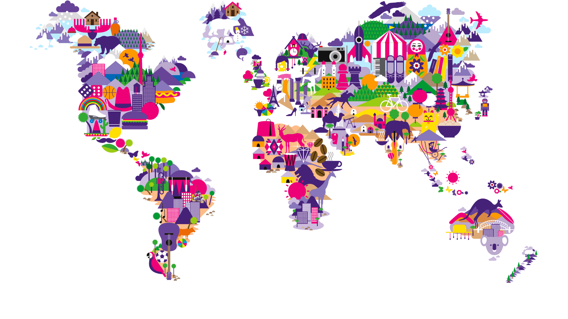
One of the leading telecoms companies in the world, at the time, STC had a subscriber base of 27 million customers domestically, and more than 160 million subscribers internationally in territories such as Kuwait, India, Malaysia, Turkey, South Africa, and Bahrain.
Our challenge was to create a name and brand that would resonate with diverse territories and their cultures.
Our solution was a new logotype that positioned STC as a progressive technology brand. Built around the concept of convergence and the merging of four services into one, we used a blend of colours based on the multiple service offering of Telephony, TV, Broadband and Mobile. Its ambient aesthetic was intended to represent the intangible digital services of the future.
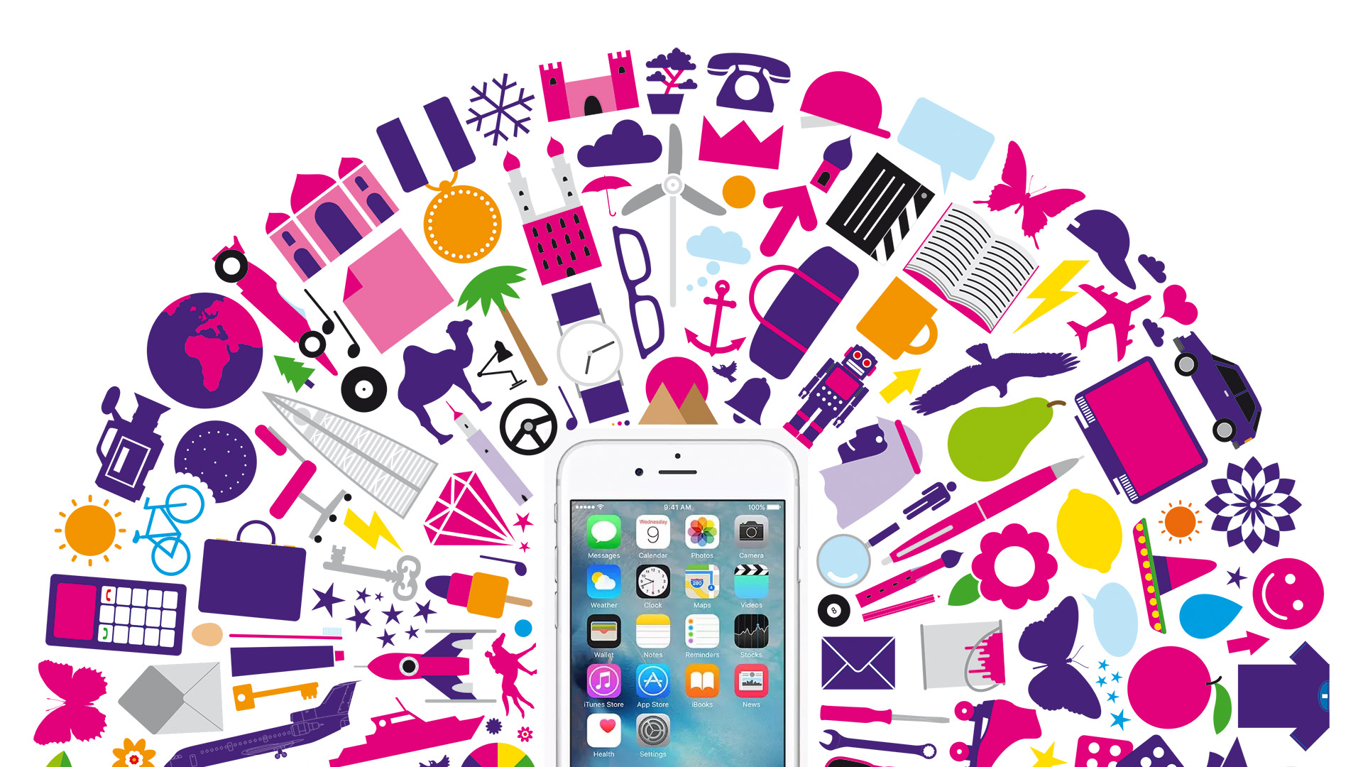
We also developed an extended set of brand assets that completely reinvigorated STC’s communications giving them more creative freedom over their look and feel as well as their messaging. This included a new brand typeface, illustration style, retail environments, guidelines, and marketing templates to ensure consistency across all customer touch points.