We partnered with UK Broadband to name and brand a unique proposition, dedicated to keeping Londoners productive and connected.
UK broadband is one of the major players in the UK broadband market. They had created a new high-speed 4G network and briefed us to position, name and brand this unique new offer. Our research found that consumers were struggling to find reliable high-speed broadband connections and London’s businesses were struggling to find or install the fibre optic cables they desperately needed. UK Broadband’s innovative new wireless offer was set to transform this.
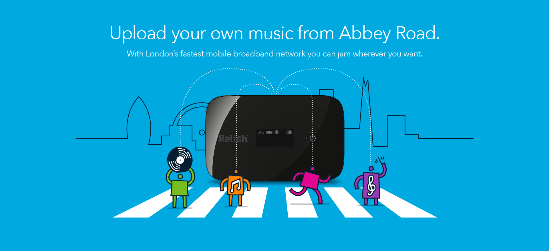
We drilled down to the heart of the proposition. The new network is made up of two distinct hardware components: a roaming pocket hub for broadband access on the go and a static home hub, for a landline-free indoor wireless broadband connection. Put simply, easy broadband access in the city, wherever you are, whatever you’re doing. The promise? Liberating Londoners To Do More.
We chose to do things differently. In a market dominated by the language of speed, we focused on ease of use. Naming is a dark art, but simplicity of thinking led us to ‘Relish’, a word that captures the user’s appreciation of the key product benefits. It made sense to focus on the user’s emotional response to the product rather than the product itself. It worked. And, it contradicted the sea of sameness in the category.
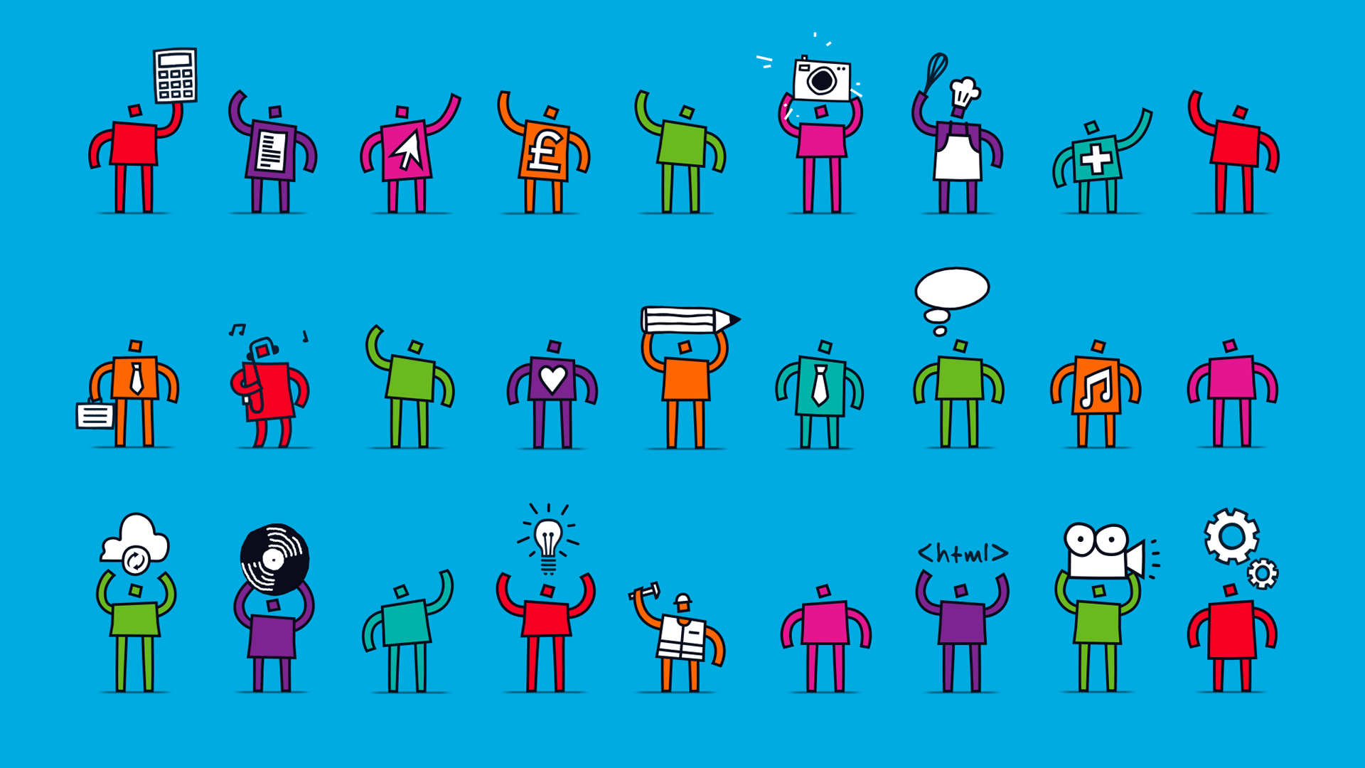
Our creative approach was inspired by Londoners. Relish is designed to support the people who keep the cogs of the city turning, so we created a brand that celebrates them. We developed a range of colourful and evocative illustrative characters that champion London’s ‘productive people’ and placed them against a backdrop of dynamic London skyline graphics. This concept resonated with UK Broadband and they recognised the opportunity to use these characters to showcase the many benefits of Relish.
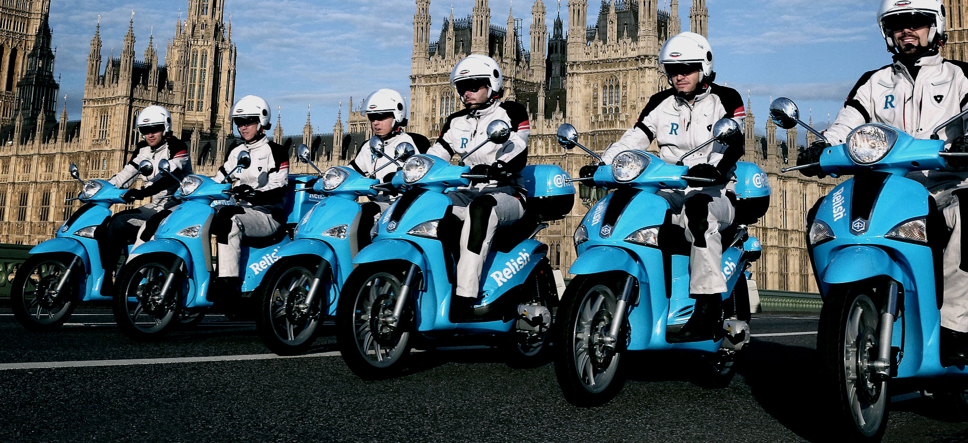
Relish was brought to life at a press launch held at the Tate Modern member’s bar. It was a chance to celebrate an innovative new brand and the city it serves against a backdrop of the iconic London skyline. A true client/agency partnership, the end result is testament to the collaborative spirit of the project. Since launching, Relish has been awarded Best Broadband Innovation at the uSwitch Broadband Awards 2015.
Best Visual Identity (Tech, Media & Telecoms) – Silver
Best Creative Strategy – Silver
Best Strategic/Creative Development Of A New Brand – Silver
Best Use Of Copy Style/Tone Of Voice – Bronze