Our brief was to help a global internet and digital services company bring together two iconic gaming brands whose titles are played by more than 100 million people and distil them into one compelling proposition. The end result was a perfect blend of heart and head – a brand identity that combined intense emotion with geometry.
A major publisher and gaming entertainment distributor, internet giant Mail.ru had previously branded games with both its own brand and My.com, something that was confusing to consumers. We were tasked with bringing the two together under one, compelling gaming brand umbrella.
Our main challenge was identifying the common themes that would appeal to every audience. It demanded a look and feel that would keep gamers in the region engaged, appeal to the leading studios that create the popular titles as well as keep investors and corporate partners happy.
The game was well and truly on.
We immersed ourself in the world of gaming. One thing stood out more than anything else – emotion. Gaming is an emotional rollercoaster for all involved. For the gamers themselves, there’s constant drama. For the studios, it’s a world of passion, and for everyone else there’s immense pride in being part of something so exciting.
Inspired by this world of intense emotion, we explored how it could come to life across the newly renamed My.Games brand world. We wanted to capture the journey of highs and lows and victories and defeats that typically go hand in hand with gaming and bring it to life in pixels.
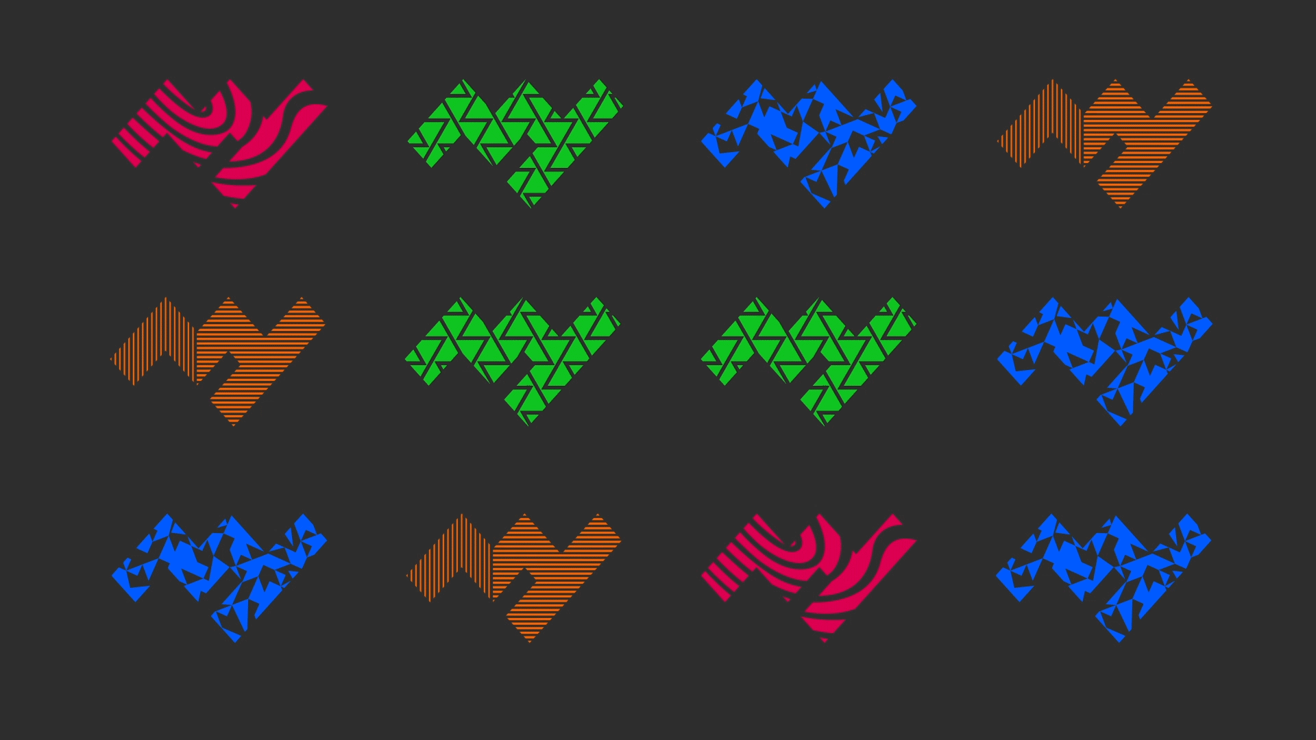
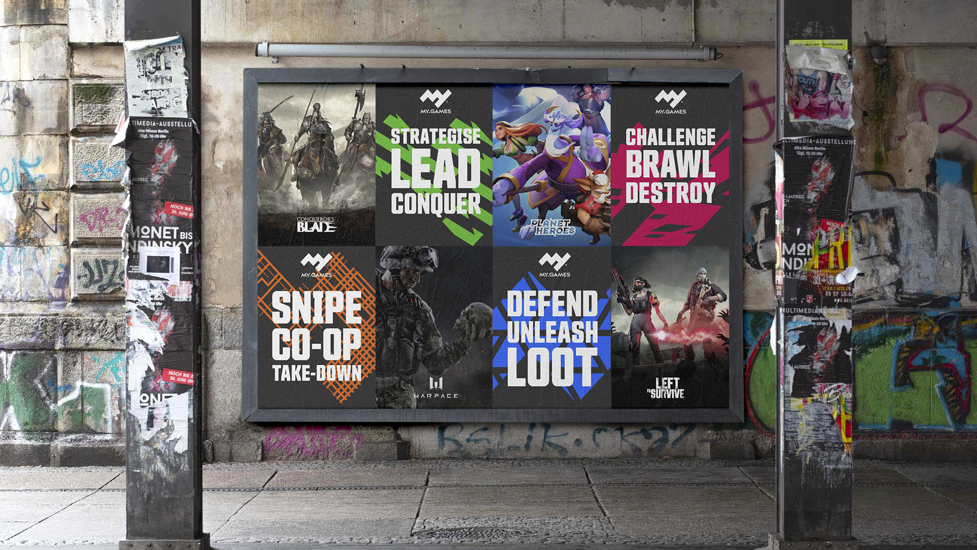
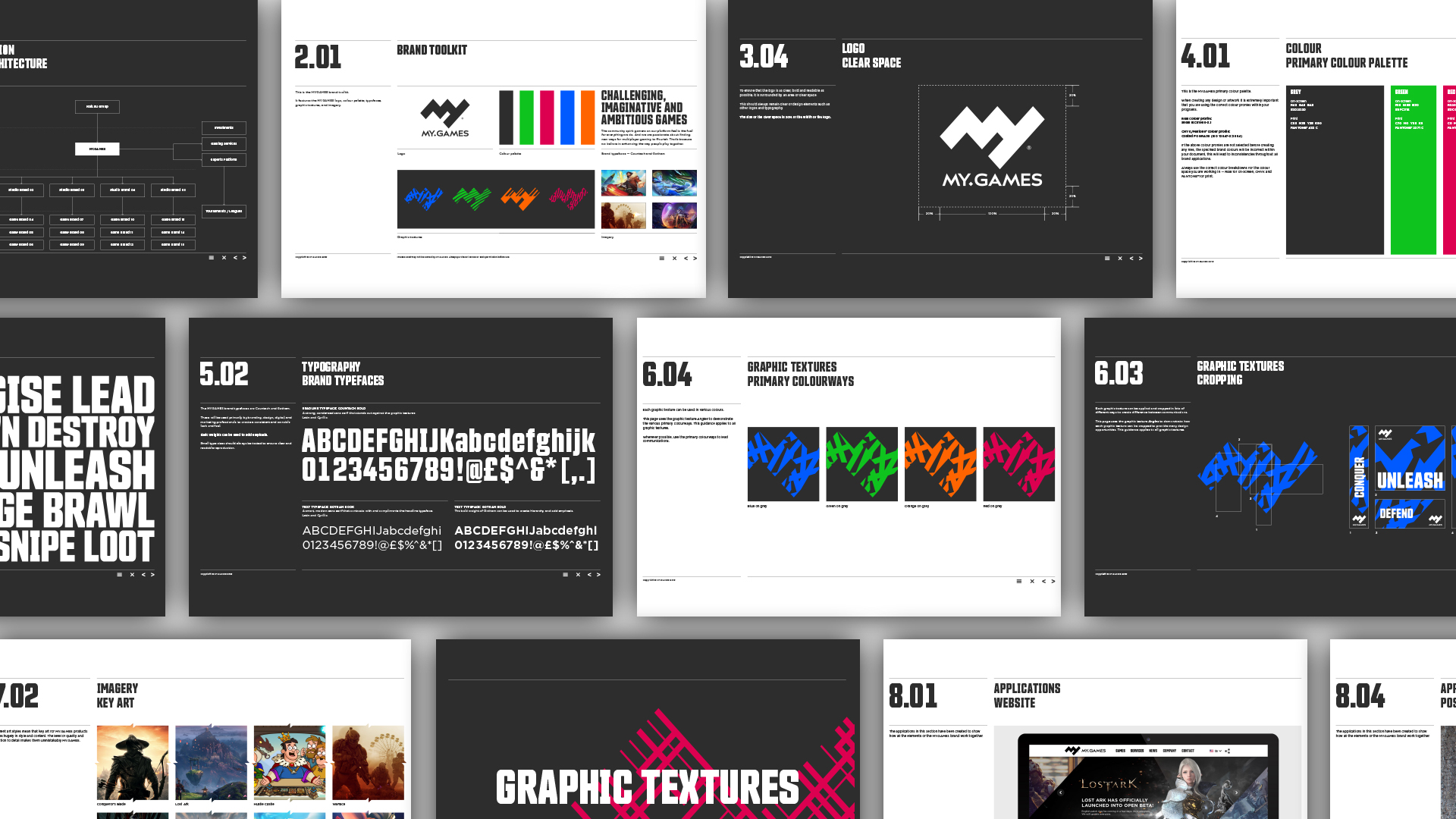
To capture this bold new direction, we created a distinctive logo based around a geometric interpretation of the letters M and Y. The logo’s simplicity of form enabled us to use the graphic space within the logotype as a window device. A suite of graphic textures were then developed which sit inside the graphic window, representing the multiple gaming experiences available across the My.Games portfolio.
This was a real end-to-end brief. From brand strategy, naming and visual identity to corporate communications, motion design and brand guidelines.
SOME MORE OF OUR WORK: